How This Washington Home Took Inspiration From Its Locale

This San Juan Island home was remodeled with new decks and patios that give it a better relationship with the dramatic landscape. The rocky hillside ends at a rugged beach and stunning water and island views.
The beauty of Washington’s San Juan Island is wild and muscular, with lush old-growth forests populated by tall Douglas firs; wide grassy vistas overlooking the Salish Sea; and rugged hillsides that roll down into rocky beaches strewn with substantial driftwood logs. Perched on a promontory, this abode has a front-row seat to those water views and other, not-too-distant islands. “We knew immediately that this was a special house,” says interior designer Andy Beers, who collaborated on the dwelling’s remodel with architects Dan Wickline, Philip Burkhardt and Christine Dennett. “The site is wrapped by the sea, and it’s not uncommon to see pods of orcas swimming by. It’s majestic and otherworldly."
When reimagining a house in a setting like this, it’s important to keep the relationship to the site at the forefront. “It was well situated when it was built in the 1980s, but some dubious decisions had been made inside,” Burkhardt says, recalling a chopped-up floor plan, a poor connection to the dramatic landscape and a discordant barrel-vaulted ceiling in the bedroom. “The clients wanted us to provide architectural clarity, make the spaces flow together and strengthen the bond to the exterior.”
Those desires became the core mission for the team, which included senior designer Laura Cariaso and general contractor Doug Guard. “We removed walls that made the living room, dining area and kitchen discrete spaces,” Burkhardt notes. “The home, which is shaped like a boomerang, had just one sliding door and several high-silled windows on the view side. By replacing all those with a series of floor-toceiling glass doors and windows, we were able to create a space that allows the interior to seamlessly join the landscape.”
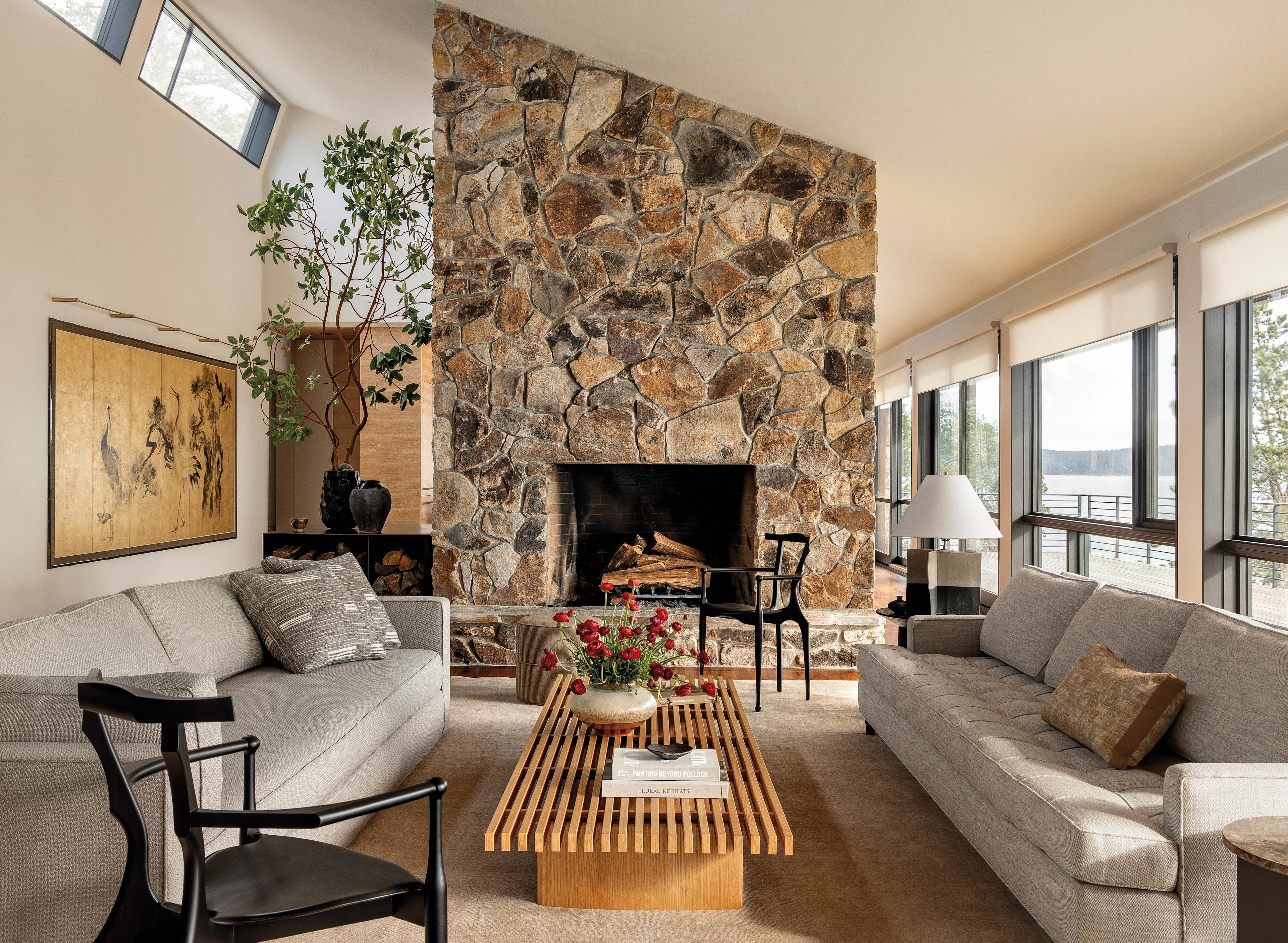
One notable feature that was left in place is the large fieldstone fireplace that stands between the living room and the kitchen and dining spaces. “That material was a hallmark of a regional modernist style popular at the time this home was built. Before the remodel, it was surrounded by dark tongue-and-groove cedar, which made the rooms feel too cabin-like,” Beers says. “Now, the backdrop is light, clean and more contemporary. This house could have easily veered into a place that felt too modern or inhospitable, but the stone warms the rooms and references the view.”
Home Details
Architecture
Dan Wickline, Philip Burkhardt and Christine Dennett, Prentiss Balance Wickline Architects
Interior Design
Andy Beers and Laura Cariaso, Ore Studios
Home Builder
Doug Guard, Doug Guard Construction
The desire for a comfortable, relaxing aesthetic fueled eclectic furniture selections that give the rooms the solidity and confidence of interiors that were collected over time. But, in fact, the designers started with a near clean slate. “The couple had been living in a Victorian home with a distinct period style,” Beers notes. “But they were game to do something new. They brought only gilded screens, a large dining table with sentimental value and a couple of rugs to the project.”
These are pieces with a narrative , and they were chosen with an understanding of who made them and why they are special and important in this interior.
–ANDY BEERS
Beers and Cariaso responded with carefully considered—think quality, not quantity—soulful pieces that have strong profiles and stories to tell. “Laura and I didn’t have a specific look or recipe for this home,” Beers notes. “We responded to the people who live here and let the site and the architecture come forward.” To hit the right notes, the designers scoured a wide variety of sources. The living room serves as a showcase for the resulting mix of modern classics (such as the Charlotte Perriand bench), statement makers (see Oscar Tusquets’ ash-and-hide chair) and handcrafted items (like the petite white oak chairs surrounding the game table). “These are pieces with a narrative, and they were chosen with an understanding of who made them and why they are special and important in this interior,” Beers says.
Comfort and ease also guided the design decisions. Seating options are extra deep, allowing residents to relax and look at the water or stretch out with a book. Finishes are warm, natural and soft to the touch. “Cozy was the main thing for our clients. Everything here is geared toward a feeling of being sheltered and creating a quiet, timeless quality,” Beers says. “This was a talented team,” Burkhardt adds. “We worked together to make a restful home that is as beautiful as its location.”


