Color sets the tone of a space—the mood, the emotion, the vibe. Glance at any beautifully designed room, and the choices might seem effortless. But every designer knows things don’t fall into place quite so easily. Here, we speak with five design professionals about how they craft a cohesive color palette, navigate timelessness versus trendiness, and which lessons they carry with them project after project.
This piece is part of LUXE’s Visionaries program celebrating our 20th anniversary. Stay tuned as we explore the “Story of Home” through the voices of leading experts and brands, culminating in our November/December 2025 anniversary issue.
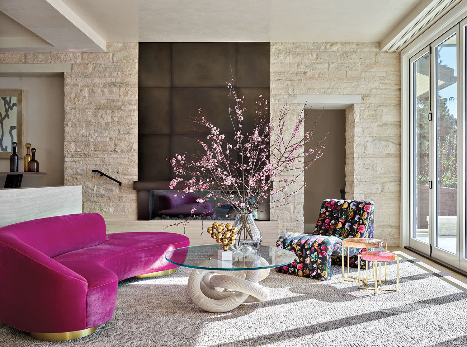
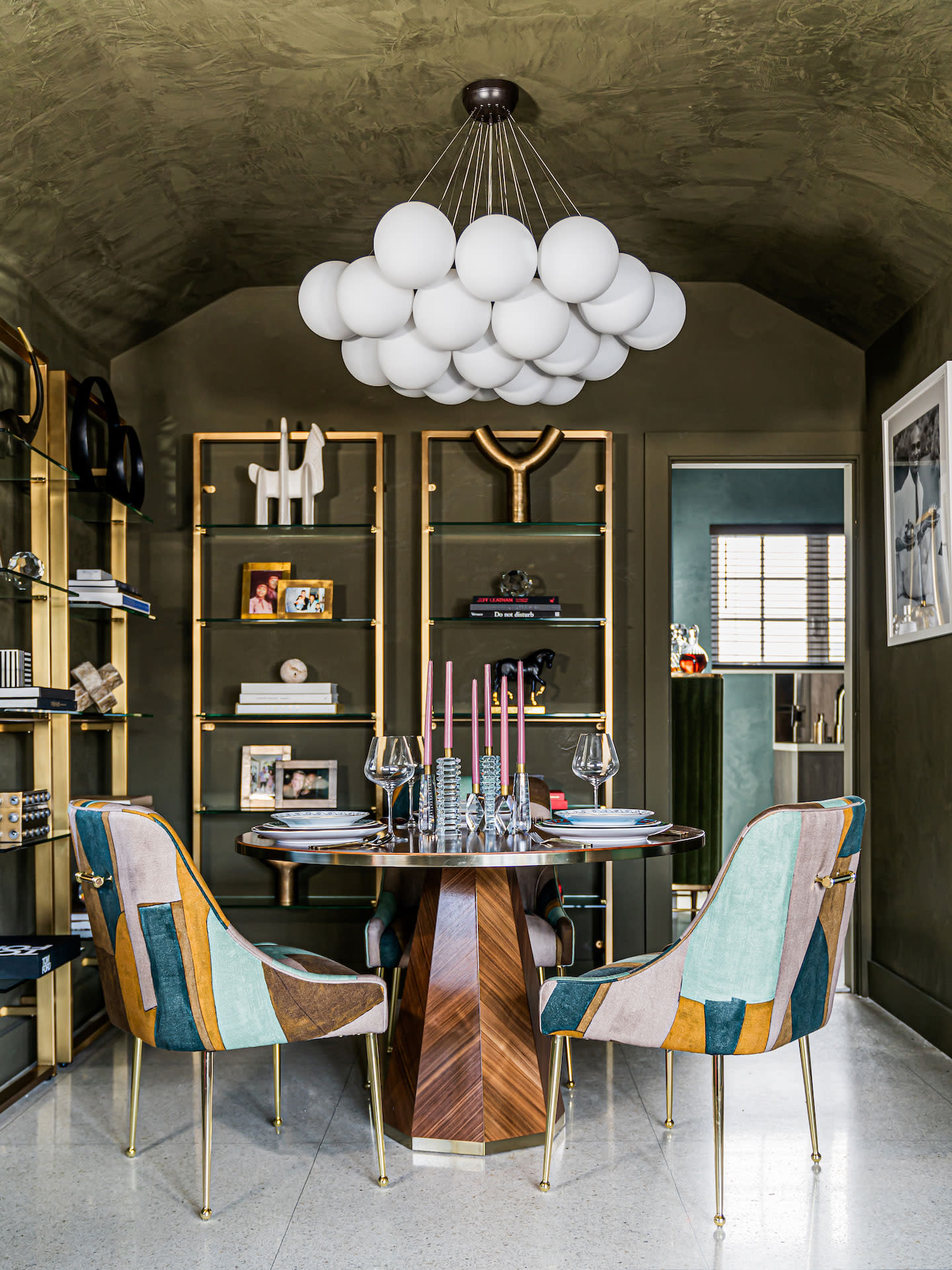
A New York project by designer Peti Lau brings together jewel tones and whites for a dreamy palette. (Styling: Martin Bourne)
Choosing Color Palettes Clients Will Love
The first step in getting to know what colors your client wants, is, well, getting to know your client—a crucial step, since oftentimes, Miami-based designer Travis London says, people don’t know who they are themselves. For London, the color journey begins with a simple question: “I say, ‘If you were getting dressed, what is the color you go to when you feel most empowered?’” It’s a prompt he tweaks room by room. “If it's the bedroom, I ask, ‘What do you what color do you put on to feel most sexy?’ In the kitchen and the dining room, I may say, ‘Which color makes you feel more fun?’ because the dining room and the living room are where you're entertaining people.”
While some homeowners need guidance to articulate their vision, others arrive with their minds set on a palette. Still, it takes a little persuasion to get them outside of their comfort zone for the benefit of the space. Designer Julie Kleiner, of Massucco Warner, recalls a long-time client whose central color choice has always been blue—no matter the house, no matter the location. “For each home that we’ve designed for her, we have added a very small dose of an accent color that she can get onboard with,” she recalls. “In a Seattle home, that color was orange, and in a home in Boston, it was apple green, and in a vacation getaway it was yellow.”
In Peti Lau’s experience, a client’s color preferences are usually tied to personality type. “I’ve always said there are two types of people: A color lover or a texture lover,” says the Los Angeles-based designer. “A color lover is typically one who is extroverted and enjoys rich colors and pattern in an interior space. A texture lover is often a more introverted person and enjoys a calmer, more subdued setting,” she explains. While she keeps those personality-based preferences in mind, she relies on the architecture of the space to determine the final color choices.
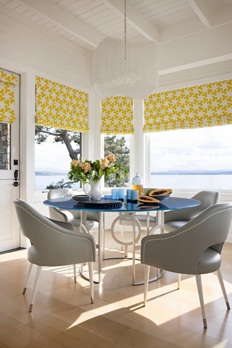
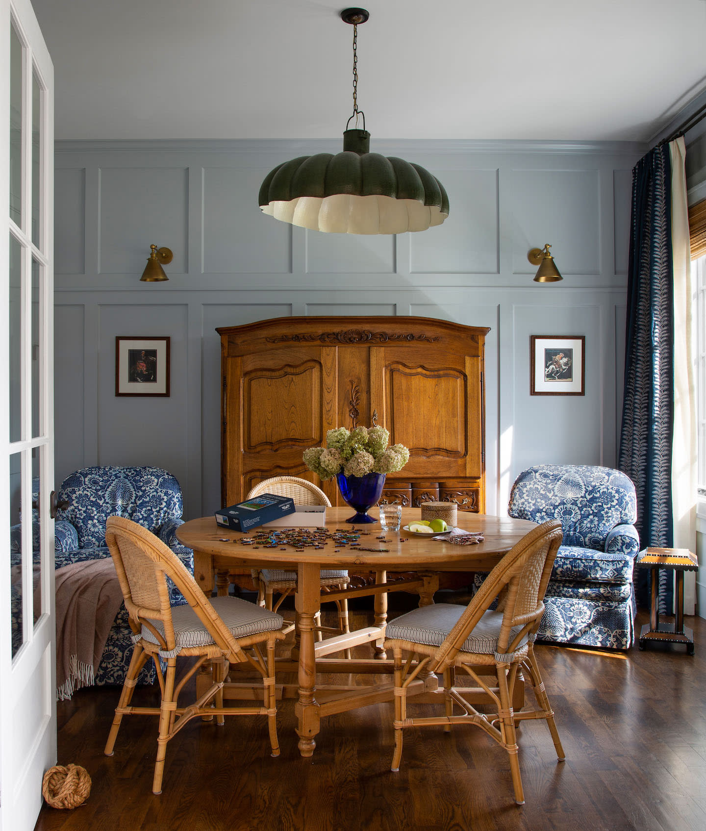
Blue may be a go-to favorite for designer Julie Kleiner’s client, but a pop of yellow brings distinctive personality to this San Juan Island vacation home.
Using Color And Finishes To Create a Unified Look
Each space calls for its own color consideration, a foundational idea all our designers mentioned. After all, a calming retreat shouldn't evoke the same energy as a lively gathering hub. As Kleiner says, “A bright pink bedroom is typically not our go-to; though a lacquered pink dining room we wouldn’t say no to!”
The key is creating a sense of flow throughout the home, so rooms don’t feel like disjointed experiences. In other words: Commit to the vision. “If you’re going to use bold color in one room, don’t let the adjacent spaces feel timid,” Tennessee-based designer Ryan Kopet says. “Color loves company. The key is balance—not every room needs to be loud, but each one should feel intentional and alive.”
Beyond the hue itself, paint finishes and their applications play an equally important role. Is the fifth wall still a thing? Should you go bold on millwork? For London, the answer is a resounding yes—a lesson he took away from time spent in Milan. “If I do a color on the wall, I'm also doing it on the ceiling and the baseboards,” he says, explaining he applies the same logic to finishes. The goal, he says, is to creative a continuous flow so your eye can’t notice separation.
For Kleiner, the sweet spot is subtle repetition. “We tend to echo finishes from space to space,” she says. “For instance, a bleached white oak table for the dining room might also be the kitchen island finish as well as a guest bedroom dresser and some living room chair legs.”
"Color has to be personal," says designer Travis London, who never shies away from going all-in on a project. The goal is always to create a cohesive look with color and finish.
The Secret Sauce To Timeless Design
No one likes a trend—or, at least, designers don’t often rely on what’s popular to inform their color choices. “A trend is always going to come and go; style is timeless,” London says. “You want to choose things that are going to age well and not fade. You should never be able to tell when a home is done.”
But how do you nail that timeless look everyone loves—the one straight out of a Nancy Meyers movie? For color lover and Denver-based designer Nadia Watts, it’s all about “the in-between hues—those that straddle two tones rather than leaning into a single, pure color.” She expands: “Think of a blue softened with green, a red enriched with blue, a grey infused with a cool undertone, or a white warmed with a hint of pink. These nuanced shades have greater longevity in a home because they shift gracefully with the light and surrounding materials, offering flexibility and depth.”
Kopet, however, argues any color can be timeless, especially when it’s rooted in nature. “Earth tones, muted greens, soft blues—they’ve been around forever and never really go out of style,” she says. “Even bolder hues like orange or purple, which we see less frequently in nature, still have a place when used thoughtfully and in moderation.”
Echoing the power and influence of the outdoors, Lau, too, points to greens and blues as trusty picks for a timeless palette. But, she says, it’s all in the saturation of the shade: “If you go to bright it can be poppy, if you go to dark It can be too moody, so it’s just getting the right shade or tone.”
“I love to embrace a client's color preferences as a foundation for the design, skillfully layering complementary furnishings and finishes to create a cohesive look,” says designer Nadia Watts.
Color Lessons That Made An Impact
Even the pros get things wrong sometimes. Just ask Lau who, with years of experience under her belt, made a rookie mistake when renovating her own bathroom. She hurriedly picked a green straight from a store swatch and full committed. “When the paint went up, it wasn’t the perfect shade of green I was hoping to achieve,” she says. Her words of wisdom? “Take the time to test and try the color in the space it is going,” she says. “Watch the light change throughout the day.”
Recognizing subtle shifts in color was one of the most striking lessons for Watts, who recalls a color theory class at the New York School of Interior Design. “We were tasked with matching paint chips by mixing different color paints together—a deceptively simple exercise that trained my eye to see the subtle shifts in hue, saturation, and value,” she says. “It was an invaluable lesson in how colors interact and how even the smallest adjustment can dramatically alter a space.”
For Kleiner, a notable takeaway was learning color doesn't always have to appear as originally imagined. She recalls a 12-year-old who asked for a “pale grape bubblegum” bedroom, but the custom color just didn't feel quite right. “Let’s just say the color got very sickly sweet pastel and would’ve given our client a mouth full of cavities had we painted her bedroom that shade!” she recalls. “We compromised and used a very subtle purple grasscloth on the ceiling instead. We kept the walls a neutral, creamy white to grow with her, and it has!”
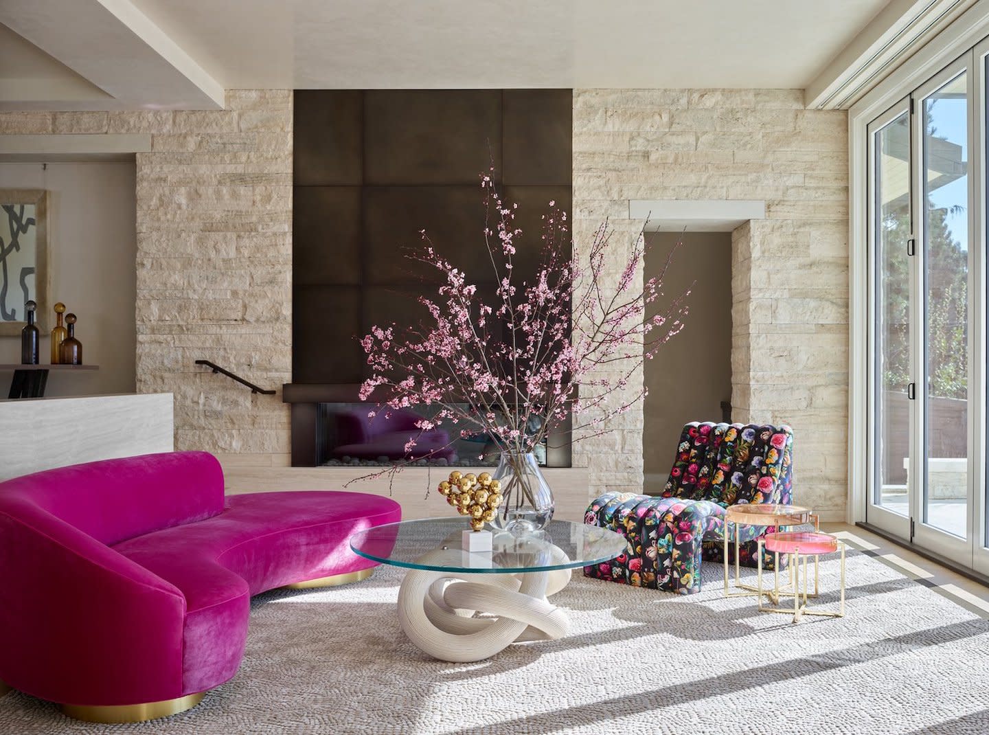
To draw people into the rooms of this colorful Seattle home, designer Julie Kleiner opted for a “hero piece” for each space. The hot-pink sofa that faces a side chair upholstered with a Christian Lacroix print, a nod to the wife’s interest in fashion.
The Intersection Of Intention And Home
At the end of the day, getting color right comes down to thoughtfulness and experience. It’s not about being bold for boldness’ sake; it's about creating spaces that feel intentional, cohesive and true to the people who live in them. As Kopet summarizes of her personal favorite color—a "power seafoam" that speaks to her roots as a Florida girl—it’s "joyful, grounding, and just the right amount of unexpected. That’s what I’m always looking for with color: something that sparks a little awe but still feels like home."
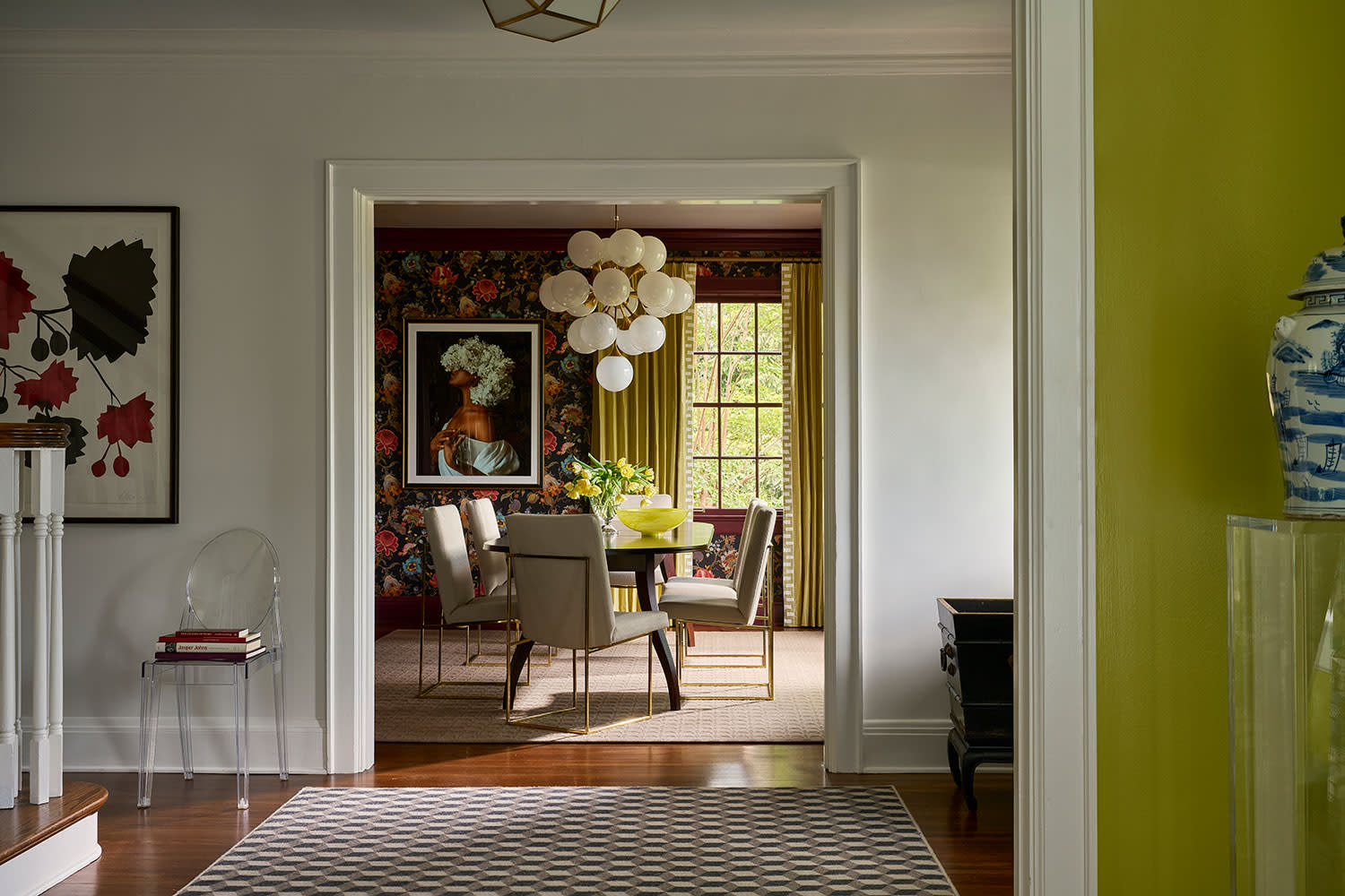
Chartreuse walls enliven a Chattanooga, Tennessee, home by designer Ryan Kopet, who leaned into the zesty shade for a client with a past in public art administration.
Special thanks to our Visionaries partners for celebrating 20 years with LUXE: 210 Design House, ADRIANA HOYOS, AjMadison, ALG Fine Art, American Screen Solutions, Amy Storm & Company, Anees Furniture, Anthony's Patio, AquaTerra Outdoors, Architectural Grille, Assure Interiors, Bailey Vermillion Interiors, Beth Krupa Interiors, Blair Burton Interiors, BSH Experience & Design Center Houston, California Closets, Candelaria Design Associates, CCS Interior Design Group, Chad Renfro Design, Chalet, Chic Design Group, Closet Factory Austin, Coastal Homes, Cohen & Hacker Architects, Collective Design, Cooper Pacific Kitchens, D'Amore Interiors, Dan Luna Woodworking, Design by Maya K, Designs By Sundown, Designscapes Colorado, Drewett Works, Eichholtz, Ellen Grasso & Sons, Encore Stone Studio, Escobedo Group, Fabricut, Farmhouse Stone, Gossett & Co., Herbst Construction Inc., Hinkley, Interiors by Maite Granda, Iraj Taghi Custom Homes, Ivette Arango Interiors, Jacobs + Interiors, Jennifer Martinez Interiors, Jessica Hasten Design, Jobe Corral Architects, JT Finneran, Kasey McCarty Interior Design Studio, Kat Black Interiors, Kelly Architects, King Living, Lemburg House, Lemmons Remodeling, Living Design Studios, LTD Builders, Martha Dayton Design, Massey Associates Architects, MK Construction & Builders, Inc., Morgante Wilson Architects, Moya Living, NR Interiors, Omnio Home Concierge, Orange Coast Interior Design, Pacific Hardwood Flooring, Paula McDonald Design Build & Interiors, Payton Addison, Pittet Architecturals, Pure Design House, r:Home, RPGA Design Group, SCH Homes, Sensi Casa, Sharif & Munir Homes, SilverLining, SKJ Interiors, Studio Celeste, Tate Studio Architects, The Design Coach, LLC, The Luxury Bed Collection, von Weise Associates, Walker Zanger, Ward Jewell Architect, AIA and Wolk Design Associates.