

Michele Erez has known designer Josh Wollowick since the third grade. So naturally, when she and her husband, Jeff, set out to redesign their Miami house, of course she would turn to her trusted childhood friend to guide the way. Michele knew that she could rely on Wollowick to give her a refreshed look and feel while at the same time honoring the home’s midcentury modern heritage.
Indeed, Wollowick envisioned a design that he describes as “Palm Springs meets Miami,” with an eclectic mix of furnishings and accessories, and shots of bold color that would speak to Michele’s discerning eye for style, honed through her time spent in the fashion world by way of her eponymous collection of luxury timepieces. “I grew up in a family that has always been involved in design and in art,” she says. And she wanted that panache to translate to her home.
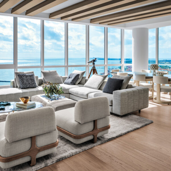
Working with architect Robert Gallagher and builder Silvair Da Cunha, Wollowick completed the redesign in stages, beginning with the living room. “Everything is glass, with 10-foot-high hedges around the perimeter,” he says. “The house is very open and bright, but the interiors had been changed to a heavier style with wood-molded cabinets and granite.” The goal was to bring it back to clean and modern. To do so, Wollowick, along with assistant designer Elizabeth Driebholz, used a fresh palette—lots of crisp white with soft grays and dashes of aqua and citrusy hues. “It’s bright and happy,” he says. “I wanted people to just walk in and smile.”
Wollowick also incorporated patterns for visual interest. “These midcentury houses are like white boxes, so prints and wallpapers add texture and warmth,” he explains. The designer nudged Michele into re-covering a pair of vintage chairs in the living room with a graphic tropical print rendered in chocolate brown and white by China Seas, for example. “I tend to like solids, because I know that I can’t go wrong with them,” she says. “But Josh pushed the envelope with those chairs. It’s a nice pop of pattern, and it works.” Wollowick, who is vigilant about using quality textiles, applauds the choice. “If you take a little risk with color and print, it really pays off,” he says.
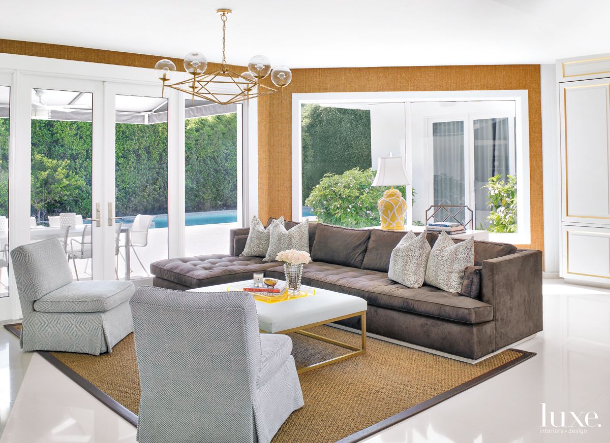
The couple have two children, so the spaces needed to be not only stylish but also family-friendly. “They’re very chill people, young and fun, so they didn’t want it to feel stuffy, and things had to be durable,” Wollowick says. He chose a chic brown microfiber fabric for the sofa in the family room—where the whole crew gathers every night, often enjoying popcorn or dessert—and designed a lofty ottoman for the room, as well. “One year later, it still looks great,” he says. The couple especially appreciate the built-in storage, which marries form and function. “Under the television, I have room for picture albums,” Michele says. “And my husband is obsessed with TV and stereo equipment, so that’s a good place to hide all of that.”
The kitchen—which had likely been renovated in the 1970s—was completely gutted and redesigned. “Michele’s a great cook, and they have family dinners every Friday,” Wollowick says. “Her husband is a lawyer, and they often have clients over. So there’s a lot of entertaining—kids, dogs, the whole thing.”
For the renovation, the couple brought in Gallagher, another familiar face as he has known Jeff for more than a decade, to reconceive the layout and make it more functional. “It was their desire to have more space that enabled having the family in the kitchen,” Gallagher says. “The pantry was too large, so a thinner one allowed ample area for a breakfast nook. And there was an adjacent room that once served as the maid’s quarters. They wanted to convert that into a playroom, so that when Michele was in the kitchen, she could keep an eye on the kids and be connected to them.” Da Cunha also remembers modernizing this space. “The kitchen that they had was not a friendly working environment, so it was completely changed,” he says. “The exhaust for the stove was relocated, and we coordinated the installation of new cabinetry and appliances.” The custom cabinetry accommodates Michele’s large collection of kitchen gadgets and new amenities such as a gas stove instead of the previous electric one.
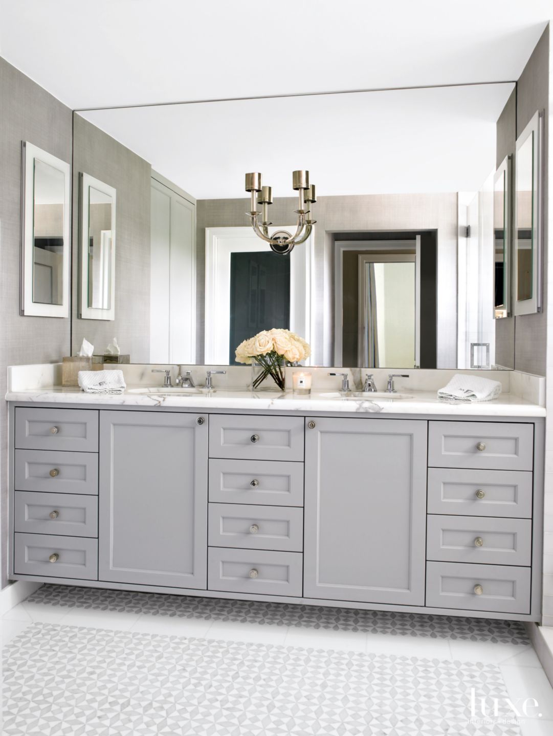
The couple’s master bathroom was gutted and restyled, as well. “They wanted a larger shower to replace the tub and shower that were already there,” Gallagher says. “They also wanted to open part of the wall for a window, so I took their thoughts, and we made it into reality.” Meanwhile, the gray-and-white palette creates a soothing oasis. “We redid the floor, which was a special design by Josh,” Da Cunha says. “It’s small pieces of marble inlaid within a border.”
With the home now returned to its original stylish 1950s vibe—with a fresh, current spin—it’s perfectly suited for an active family. “A lot of older homes are being torn down,” Michele says. “There are a lot of things that are original to this house, and they make it unique. We bought the house because we love the architecture and its history, but we wanted to give it a modern interpretation.” The result is an updated midcentury modern, Palm Springs-meets-Miami home 30 years in the making.
—Kimberly Olson